
Your analytics can tell you how many people visited a page and how many left without clicking anything. What they can’t tell you is what happened in between – where people looked, what they ignored, and at what point they lost interest.
Heatmaps fill that gap. Instead of a number saying 60% of visitors left the page, you get a visual showing exactly where those visitors stopped scrolling, which element they clicked most, and which section of the page got zero attention.
This guide covers how heatmaps work, what each type shows you, and how to read the patterns once you have them – so you can make page changes based on data instead of guesswork.
In This Article:
What Is a Website Heatmap?
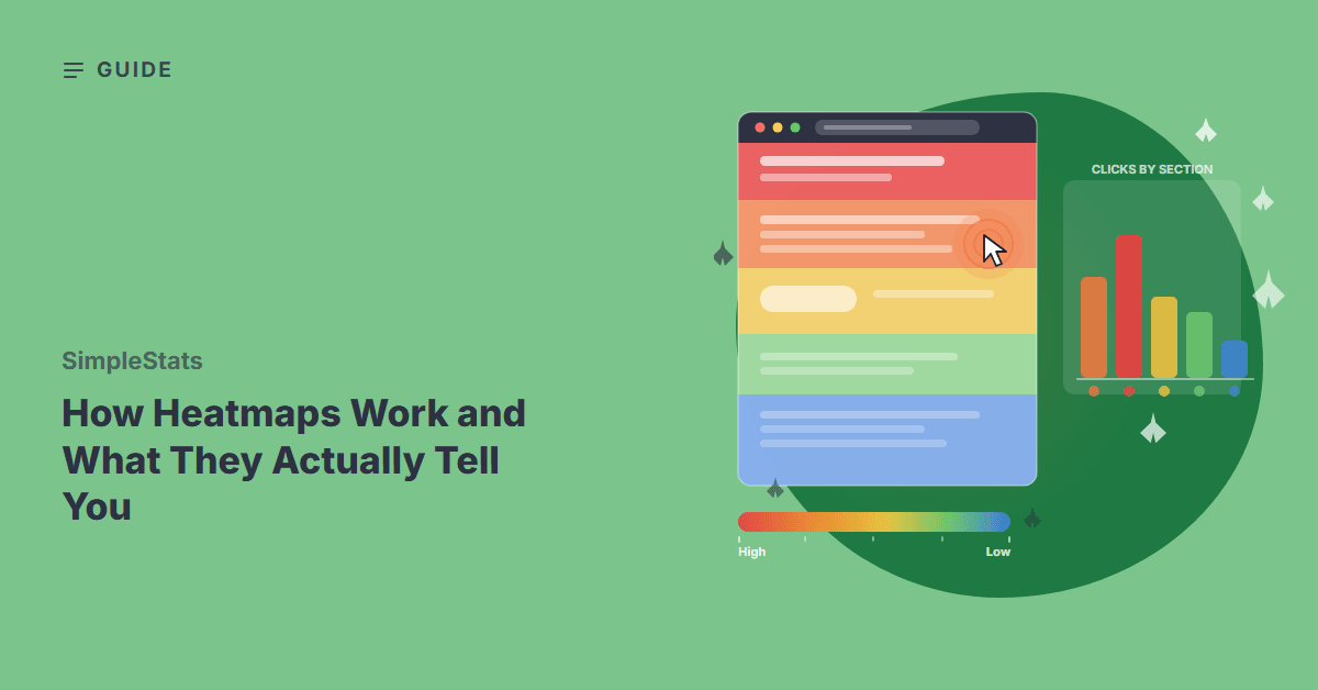
A heatmap is a color-coded overlay placed on top of your webpage that shows where visitors click, how far they scroll, and which zones get the most engagement. Colors run from red (high activity) to blue (low activity), giving you an at-a-glance picture of where attention concentrates and where it doesn’t.
The term comes from data visualization – the same technique used to show weather patterns, stock market trends, or population density. Applied to websites, it replaces rows of numbers with a color layer sitting directly on your actual page design, which makes patterns much easier to spot than reading a table.
Unlike standard analytics – which track traffic sources, sessions, and pages visited – heatmaps focus on behavior within a single page. They answer a different question: not “where did visitors come from?” but “what did they do once they arrived?” That shift in perspective is where most of the value lies.
Key Takeaway: Heatmaps show visitor behavior on a specific page – where people click, scroll, and engage – adding a visual layer that traffic numbers alone can’t provide.
How Heatmaps Collect Data
Heatmaps work by running a small tracking script on your pages that records every click, scroll position, and cursor movement as a visitor browses. The script sends this data to your analytics platform after each session ends.
The data is then aggregated across many visits. No individual visitor’s full path is displayed – what you see is the combined pattern from everyone who visited that page during your chosen date range. Aggregation is what makes heatmaps useful for spotting trends rather than being distracted by outliers.
Most heatmap tools let you filter by device type, date range, and traffic source. Device filtering matters more than it might seem. Desktop and mobile visitors interact very differently with the same page – a click map that looks healthy on desktop might reveal that your primary CTA sits below the fold for most phone screens. Viewing the combined data hides that problem completely.
The Three Main Types of Heatmaps
Not all heatmaps show the same thing. The three main types each capture a different dimension of visitor behavior – and knowing which one answers which question saves you from running the wrong map on the wrong problem.
Click Maps
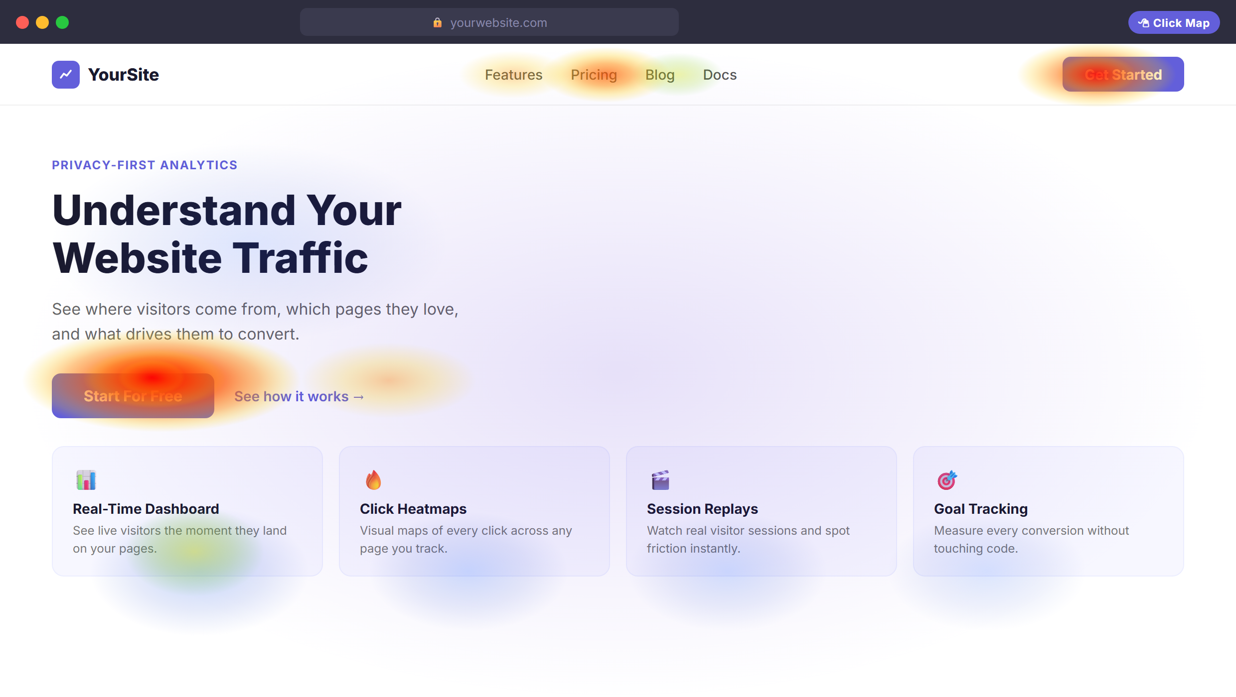
Click maps show where visitors click on a page. Hot spots (red and orange) reveal which elements draw the most interaction. Cold spots (blue and green) show what visitors ignore.
The most useful thing a click map surfaces is when people click on things that aren’t links. If visitors repeatedly click a headline, a product image, or a decorative icon that doesn’t respond, that’s a clear signal they expected something to happen there. You can either add a link or change the design so it stops creating that expectation.
Click maps also expose underperforming CTAs. If a button you consider important shows less activity than nearby secondary text or an image, you have a conversion problem with a clear starting point – whether that’s placement, color, or copy.
Scroll Maps
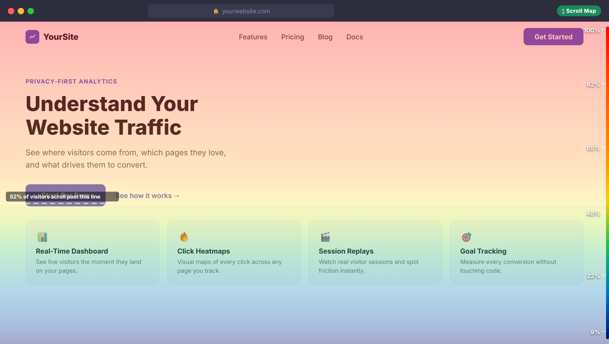
Scroll maps show how far down a page visitors actually scroll. The percentage who reach each section is shown as a color band – bright red at the top, cooling off as the page goes deeper. The number overlaid on each band tells you the exact percentage of visitors who made it that far.
The most important point on a scroll map is the drop-off threshold – where the majority of visitors stop. Any content below that threshold reaches only a fraction of your audience. If your main offer, pricing, or CTA sits below it, you have a placement problem you can fix without rewriting a single word of copy.
Scroll maps are particularly useful for long landing pages and blog posts. A common finding: the bottom 40% of a page reaches fewer than 20% of visitors. Knowing this changes how you prioritize what goes where. Your strongest argument shouldn’t sit where only your most engaged readers ever get to.
Move Maps
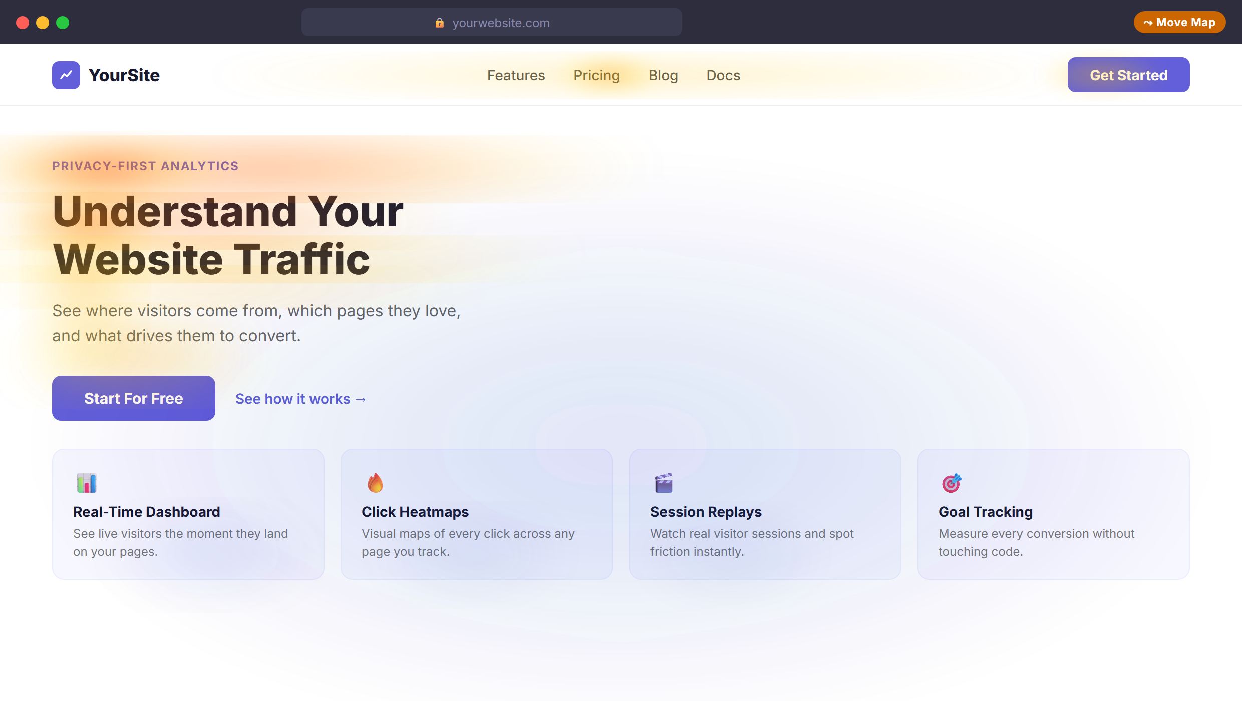
Move maps record where visitors move their cursor across the page. Research suggests a rough correlation between cursor position and where someone is reading – though this relationship is less reliable than click or scroll data, and move maps aren’t offered by every tool.
Where move maps earn their place is in identifying “false floors” – visual breaks in the layout that make visitors think the page has ended when it hasn’t. If cursor movement clusters and then stops at a horizontal line or a section separator, visitors may be deciding the page is over and leaving without seeing what’s below.
Hover clusters around specific paragraphs often mean that text is being read closely. If you’re deciding where to place your key message or most important benefit, move maps can show you where visitors are already slowing down and paying attention.
The Bottom Line
Start with click and scroll maps – they’re the most immediately actionable. Click maps diagnose conversion problems; scroll maps reveal placement issues. Move maps add useful context once you’ve worked through the basics.
What Heatmaps Actually Tell You
Looking at a heatmap for the first time, the instinct is to find the brightest red spot and declare it important. The actual insight comes from the gap between where you expected attention to land and where it actually did.
Here are the patterns that consistently surface something worth fixing:
- Clicks on non-interactive elements. Visitors clicking images, text, or icons that don’t respond. This signals a missing link or a design element that creates a false expectation of interactivity.
- Cold CTAs. A button or link with far less activity than you’d expect. Could be a visibility problem, a placement problem, or a copy problem – the heatmap tells you there’s an issue; other methods help identify the cause.
- Sharp scroll drop-offs. A sudden decrease in the percentage of visitors reaching a section. The content above that point may be creating a visual end-of-page signal, or simply failing to hold attention.
- Ignored secondary content. Sidebars, feature lists, or benefit sections that consistently show no activity. These elements may not need rewriting – they may just need moving above the drop-off threshold.
- Distracted clicks near the top. High click activity on decorative or secondary elements near the top of the page often signals that visitors aren’t finding what they came for quickly enough.
Try SimpleStats Free
No cookies, no setup headaches, no credit card needed. See your traffic in minutes.
Get SimpleStats Now →When to Use Heatmaps
Heatmaps aren’t something you check daily like a traffic dashboard. They’re most useful when you have a specific question about a specific page.
Good situations to run a heatmap:
- A page gets consistent traffic but below-average conversions
- You’ve changed a page design and want to see whether the new layout is working
- A landing page has a high exit rate but you don’t know which section is losing people
- You’ve added a new feature, section, or CTA and want to confirm visitors are finding it
- You’re prioritizing a redesign and need data to back up layout decisions before committing
For a heatmap to be statistically reliable, you generally need at least 500 to 1,000 visits to that page. High-traffic pages like a homepage or a main product page can reach this threshold within days. Lower-traffic pages may need several weeks – and that’s fine. A heatmap built on several weeks of steady traffic is more reliable than one built on a short campaign burst that brought an unusual audience.
Once you have a heatmap, pair it with session recordings. Heatmaps show the aggregate pattern; recordings let you watch individual sessions to understand the behavior behind the pattern. Used together, they’re more effective than either is alone.
Pair heatmaps with session recordings to understand the why behind every pattern.
Key Takeaway: Run heatmaps on pages where you have a specific question. 500+ visits gives you a reliable pattern – don’t try to read conclusions from a thin dataset.
Heatmaps and Analytics: Better Together
Standard analytics and heatmaps answer different questions. Traffic analytics tells you which pages are performing – heatmaps tell you why a particular page is performing the way it is. Neither replaces the other.
A common workflow: your analytics flags a landing page with strong traffic but a conversion rate well below the site average. You run a heatmap and discover that 80% of visitors stop scrolling before they ever reach the pricing section. You move pricing higher on the page. Conversions improve. That’s the loop – analytics identifies the problem page, heatmaps diagnose what’s happening on it.
Most site owners run analytics and heatmaps as two separate tools – one subscription for traffic data, another for behavior data. SimpleStats includes both in one place, along with session recordings, so you can move from “this page has a problem” to “here’s what visitors are actually doing on it” without switching tools or tabs. It works on any website and starts collecting data immediately after a one-line install.
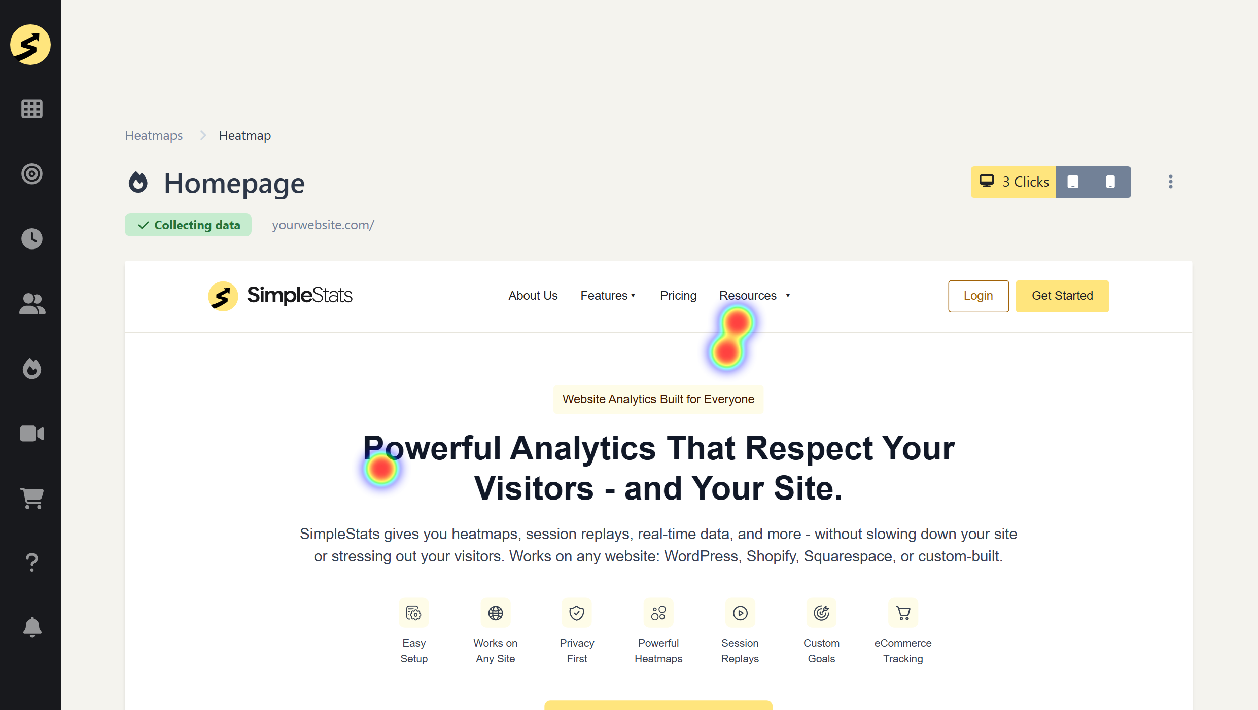
Heatmaps give you something traffic data can’t – a picture of what actually happens on your pages. Once you can see where people click and how far they scroll, fixing a low-converting page stops being guesswork. Start with your highest-traffic pages, form a specific hypothesis, and let the data guide the next change.
Recommended Reading
Try SimpleStats Free
No cookies, no setup headaches, no credit card needed. See your traffic in minutes.
Get SimpleStats Now →Frequently Asked Questions
Do heatmaps slow down my website?
A well-built heatmap script adds only a few kilobytes to your page – negligible impact on load time. The data is collected asynchronously, meaning it never blocks your page from loading. If page speed is a priority, check your specific tool’s script weight and run a before-and-after test with a tool like Google PageSpeed Insights.
Do I need a cookie banner to use heatmaps?
It depends on the tool and how it stores session data. Some heatmap tools use cookies that trigger GDPR consent requirements. Others use session-level identifiers stored in the browser that don’t count as personal data under most privacy frameworks. Always review your specific tool’s privacy documentation before assuming a banner isn’t needed – the answer varies by tool and jurisdiction.
How many visits does a page need before a heatmap is useful?
Most practitioners recommend at least 500 to 1,000 visits before drawing conclusions. With fewer visits, the pattern can be skewed by a handful of unusual sessions. High-traffic pages reach this threshold quickly. For lower-traffic pages, run the heatmap over a longer window – a few weeks of steady traffic produces a more reliable picture than a single campaign burst.
What’s the difference between a heatmap and a session recording?
A heatmap aggregates data from many visits into one visual – you’re seeing the average behavior of all visitors to that page over a date range. A session recording shows you one individual visit in real time, like watching someone use your site. Use heatmaps to spot patterns across a large number of visits, then use recordings to understand the specific behavior behind a pattern. They work best together.
Can heatmaps work on mobile?
Yes. Click maps and scroll maps work the same way on mobile – every tap registers as a click, and scroll depth is tracked per session. Move maps are largely irrelevant on mobile since there’s no cursor. One important step: always filter heatmap data by device type. Mobile and desktop visitors often behave very differently on the same page, and combined data can obscure what’s actually happening on either one.